A Landscape Limited Color Palette
A light bulb illuminated in my head while participating in an online painting course by Scott Christensen (Adventure of Painting). He was illustrating the color harmony of a limited palette, where all colors in a painting relate to each other because they are mixed from a few base colors. Applying this strategy to my own painting greatly improved the overall look and my ability to judge and mix colors.
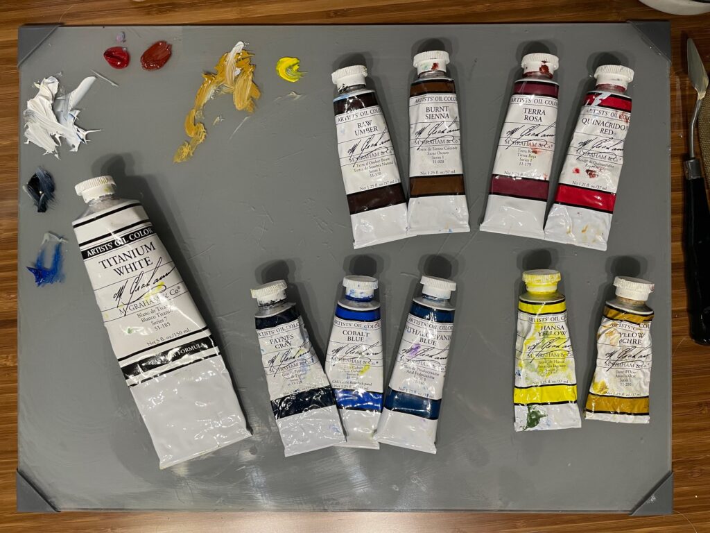
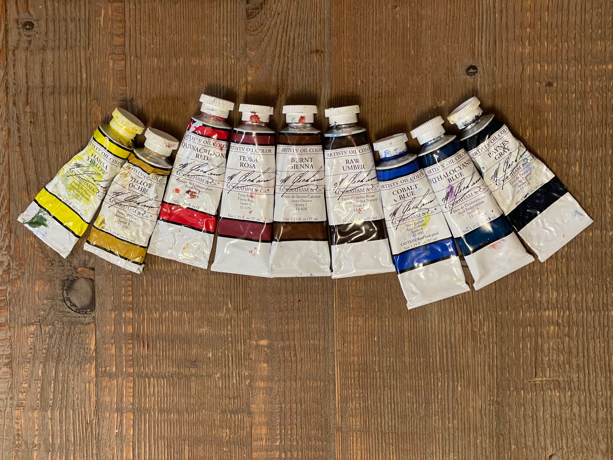
I now begin all paintings with Titanium White and a red, blue and yellow from the collection in the photo. My most common combo is Terra Rosa, Cobalt Blue and Hansa Yellow. All greens and other colors are mixed from these three. If I need a darker dark, I sometimes add Paynes Gray (which is a very dark blue-gray). If I need turquoise for a glacial lake, I add the greener Phthalo Blue (which is a potent danger zone of a color btw!). I will bring in other colors only once I have a specific reason to do so.
I use M. Graham brand simply because this is the mid-price option available locally at Blaine’s. No complaints! I like them. They are smooth and don’t require adjustment with mediums to paint. I do sometimes wish they were heavier-bodied to show more texture. Also, I love a gray glass palette as neutral base to mix colors on. These are all the colors I’m using at this time:
- Titanium White
- Hansa Yellow
- Yellow Ochre
- Quinacridone Red
- Terra Rosa
- Burnt Sienna
- Raw Umber
- Cobalt Blue
- Phthalocyanine Blue
- Paynes Gray